Accessible Design
Images
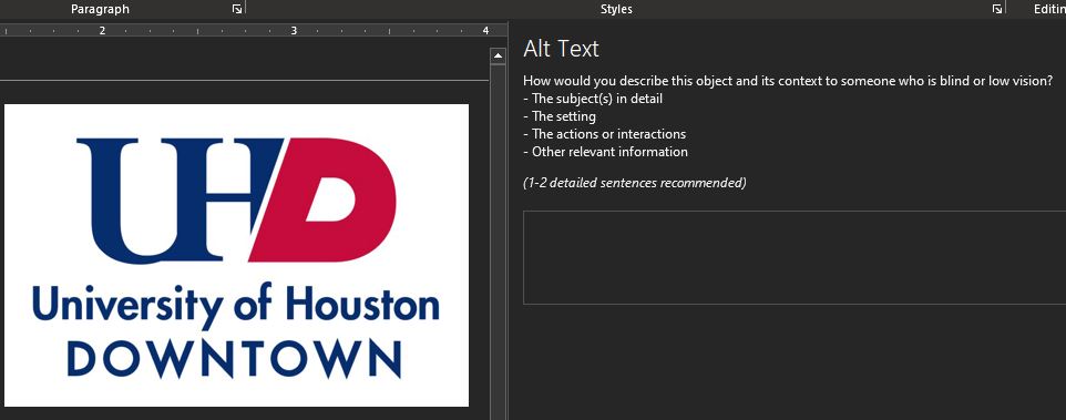
A screenshot of a logo in a Word document with the alt text entry box shown.
Alternative Text / Tag for Images
"Alternative (Alt) Text is meant to convey the “why” of the image as it relates to the content of a document or webpage. It is read aloud to users by screen reader software, and it is indexed by search engines. It also displays on the page if the image fails to load, as in this example of a missing image." (Harvard.edu)
Add ALT Text in Microsoft Office applications:
- click on the image, photo, chart, or graph.
- Right click and on this menu select 'Edit Alt Text' near the bottom of this menu
- In the Alt Text pane and 1 - 2 sentence describing the image or object for someone with limited or no vision
Tips for ALT Text / Tags
- Keep ALT text on your images short and meaningful because it cannot be paused while using a screen reader
- Only describe the image in your ALT text, do not add notes and comments or commentary
- Add a period at the end of your ALT text statement to give screen readers a longer pause
- Add a comma at the end of your ALT text statement if you want to give screen readers a shorter pause
Tips for Accessible Images
- Decorative items such as headings, footers, borders, page numbers, solid background color blocks, icons, banners should all be set to 'artifcats' in Adobe Acrobat DC and InDesign. In Microsoft applications these should be set to 'decoration'.
- For charts, graphs, infographics, do not rely on color alone to convey meaning. Include patterns as well to differentiate information
Links to More Information on ALT Text and Tags
- How to Add ALT Text in M.S. PowerPoint and Word
- Beyond the ALT Tag: Accessible Name
- W3C ALT Text Decision Tree
Accessible and Inclusive Font Guidelines
- If in doubt for font choice, use Verdana which is available on most Windows operating system installations. For digital documents and projects, use a sans-serif font.
- Keep font types to a minimum of two to three styles per document or project
- Avoid highly decorative, fancy, hand written, script and cursive fonts to maximize readability and accessibility
- Larger fonts are preferred for digital projects and for the web. 16 pixels minimum
- Avoid unnecessary underlining and italics for headings
- Limit the use of ALL CAPS, especially for headings
- Size, spacing and color of text can significantly impact inclusivity: Increasing the line spacing or leading can help legibility, example if your text size is at 12 points, your leading should be 16 points.
- Use dark or black text on a white background and white on a dark or black background
Inclusive Fonts
- Try to choose an inclusive font one that removes barriers for all audiences. Example of a bad font choice would be where you cannot differentiate between a lower case "L", and upper case "I" or the number 1. Choose a font that makes these character differences obvious
- Choose a font that supports multilingual content - that is, has glyphs or characters with diacritical marks (use the Character Map on Windows OS to find fonts with multilingual characters)
(Inclusive font information from 'Creating Inclusive Content' LinkedIn Learning Course)
Accessible and Inclusive Color Guidelines
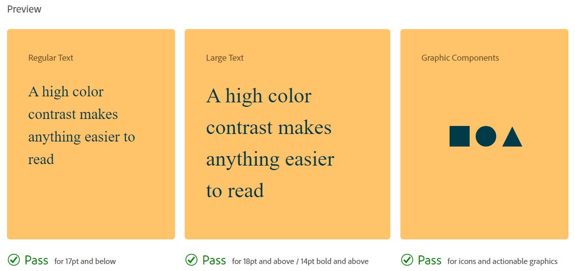
- Follow the Word Wide Web Consortium (W3C) guide lines for color contract ratio for web and for print (UHD web follows WCAG 2.2)
- Avoid the use of color alone to establish meaning or using complex color pallets, and selecting colors without considering possible vision challenges
- Avoid using these color combinations: green & red, green & brown, blue & purple, green & blue, light green & yellow, blue & grey, green & grey, and green & black
- Use monochromatic or bright colors
- Use a color checker for contrast and color deficiency such as the Adobe Color Checker which is free to use.
- Free Color Contrast Analyzer for Mac and PC
- WebAIM Online Color Contrast Checker
Accessible Document and Presentation Layout / Design
Presentations
When designing your PowerPoint presentation, remember to include a title for each slide. Ensure the reading order is correct for each slide, this is what assistive technologies will rely upon.
- Ensure each slide has a title
- Ensure the reading order is correct for each slide
Using Accessibility Checker in PowerPoint to Fix Errors (YouTube)
Tables in Presentations and Documents
"Always avoid tables as a lay out choice for textual content. The screen reader will read cells left to right, which may not be the correct content hierarchy. Screen reader users can choose to navigate page content by level 2 and 3 headings." (Lizzie Bruce)
For M.S. PowerPoint and Word, avoid using tables as a method to layout your content.
- If content needs to be compared, use a simple table.
- Avoid merged cells and nested cells. Tables are highly problematic for accessibility. This problem carries over into PDF versions of your documents and presentations and you will have to do extra work in Adobe Acrobat DC to make your PDF accessible.
"Simple data tables that include nested tables or that require two rows in order to explain information contained in the columns are difficult to tag for accessibility." (U of Minnesota).
Read more about accessibility and tables.
Accessible Graphic Design Resources
- Accessible Graphic Design
- Accessible Graphics and Images
- Designing for Accessibility and Inclusion
- Accessible Infographics and Fliers Checklist
Inclusive Design and Content Resources